Blog
Accelerate your data insights
Dec 02, 2021 | John Chinnici
Dec 02, 2021 | John Chinnici
Time-to-insights is a driving force behind commercial success. A data platform may combine disparate data across your organization, but this alone doesn’t necessarily yield rapid business insights. The more addressable challenge is the speed of getting the data out in a meaningful way.
Data science explainability through simple visualization yields meaningful data. If non-technical leaders can use the same datasets to visualize and understand insights, then commercial teams can more quickly take action and trust decisions. Most organizations use secondary tools to drive business intelligence today, but explainability is included as part of the Veeva Nitro data science and analytics platform.
Nitro Explorer helps customers dig into their data and build analytics around it faster than ever before. This intuitive visualization and exploration tool enables data scientists and their commercial business peers to explore data within interactive charts and dashboards. With business intelligence tied directly to the same dataset, you can easily share visualizations across the organization to accelerate time-to-insights for both headquarters and field teams.
Build and analyze datasets
Visualization starts with the creation of datasets (either physical datasets based on database tables or virtual ones resulting from your queries). With SQL Lab, users won’t need additional querying tools. SQL Editor enables exploration of schemas, definitions of the tables within, and the data. This allows a power user to manipulate that data through simple selections or more complex SQL to build standard datasets that can be used by the broader commercial operations team across their visualizations. As a result, non-technical users base their queries on the same metrics and roll-ups, and they aren’t required to understand SQL to make it happen.
Visualize your data
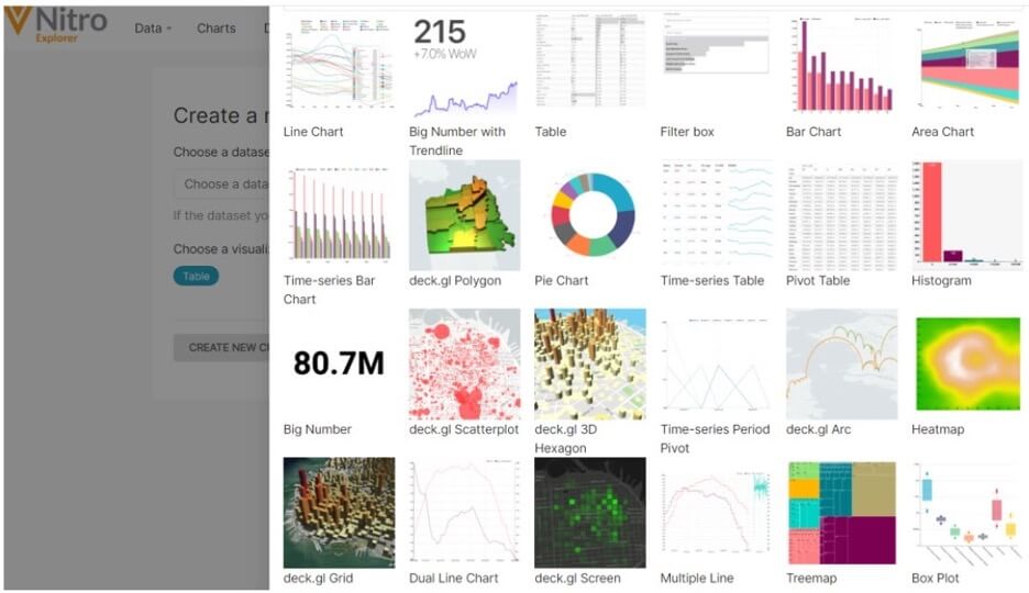
Once the datasets are created and saved, they can be explored visually through the chart feature driven directly from SQL Editor. As users begin to understand their data, they can determine the best way to visualize it through the visualization type selection. Make content or style changes with a few simple clicks.
Since Nitro Explorer is based on Apache Superset, a lightweight and scalable data visualization tool with a wide variety of chart styles, users aren’t limited to simple bar and line charts. More sophisticated options include geographic maps, time-series tables, heatmaps, or word clouds.

Easily create dashboards
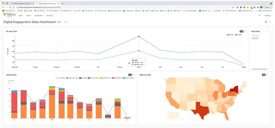
After building a virtual data set, exploring the data, and creating the desired visualization type, users can pull charts into a new or existing dashboard. Simply select the layout type and choose from a list of charts available to drag and drop into the dashboard. Decide the order of the charts, add filters, add new rows to the dashboard, and resize as needed – all from one screen.
Accelerate time-to-insights
With Nitro Explorer, data scientists can easily publish visualizations for all users who may need them. Share the dashboard a number of different ways: export to .csv directly from Nitro Explorer, push to Veeva CRM directly from Veeva Nitro, or provide a static view of the dashboard by downloading an image.

To learn more about how Nitro Explorer works, watch our demo.